Customised Comparison Table - Flagship Devices
Redesigning the Galaxy Z Flip7 and Z Fold7 comparison table into a customised, customer-led tool — letting shoppers compare the latest flagships against their own current phone to drive upgrade and switching conversion.
Client
Samsung Electronics · Cheil
Role
Lead UX/UI Designer
Duration
2025
Platform
Desktop · Mobile
Outcomes — directional
Trade-In adoption
+12,000 trade-ins / qtr
vs. pre-launch baseline
Add-to-Cart conversion
+11,400 orders / qtr
from comparison-led sessions
Compare tool engagement
168K user interactions / mo
reach into bottom-of-page tool
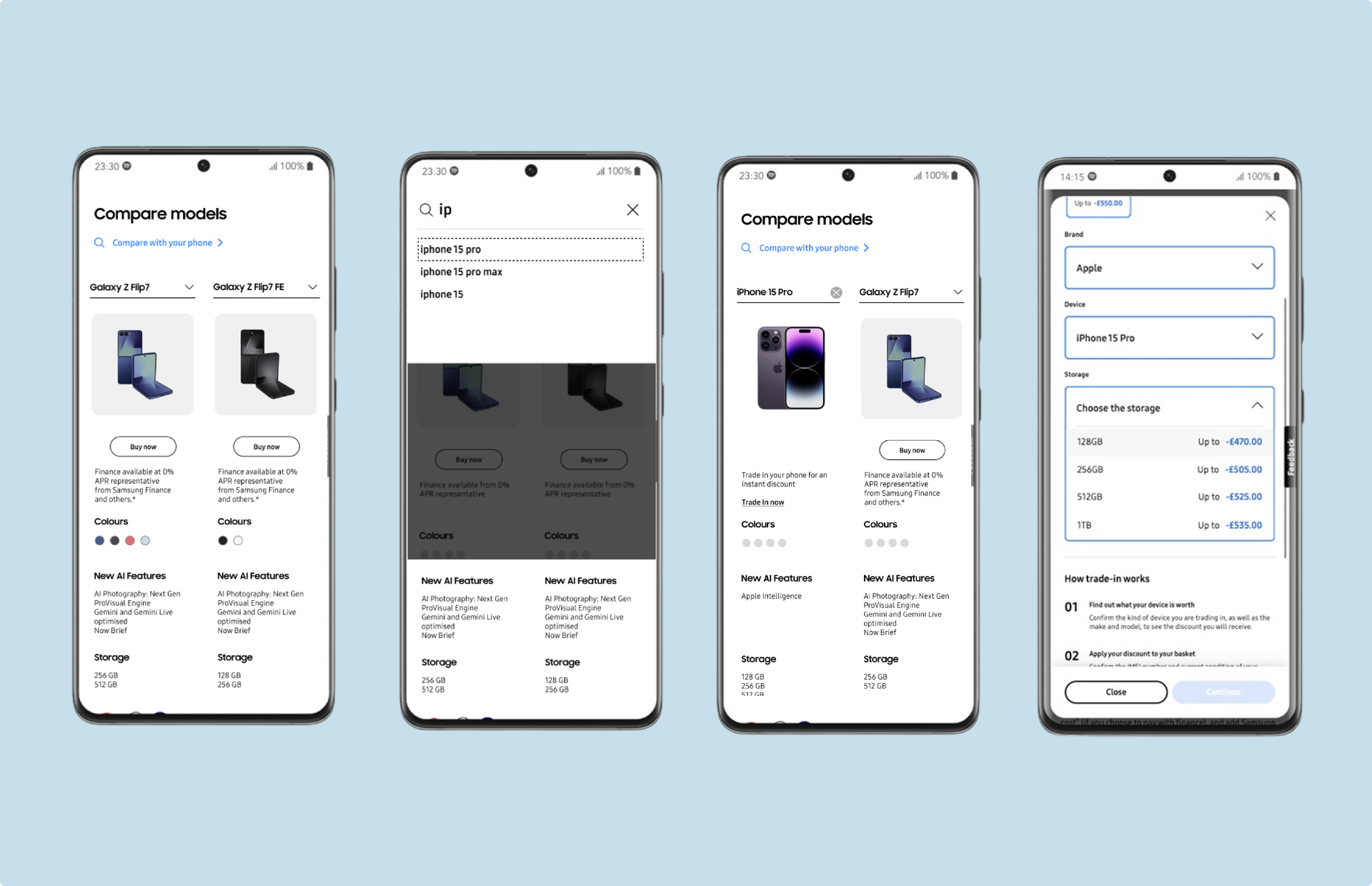
With the launch of the Galaxy Z Flip7 and Z Fold7, the existing buy-page comparison table only compared new Galaxy models against each other. It answered "Which new Galaxy should I get?" — but the real customer question is "Is any new Galaxy significantly better than what I already have, and why?" The result was a comparison tool that ignored the user's current phone, offered no path for iPhone switchers, and quietly under-served the broadest part of the audience.
A customised comparison table directly addresses the broader, more powerful question — making it a far more effective tool for driving engagement, reducing decision friction and improving conversion.
Providing customers with an intuitive way to compare the latest flagship products against their own device will enhance their understanding of key differences and features across the range. This should help them make more informed purchasing decisions and drive conversions. Success is validated by a measurable uplift in add-to-cart rates and overall Sales CVR originating from interactions with the comparison table.
Customer-initiated comparison: the user actively selects their own device inside the comparison tool, and Trade-In is offered with a pre-populated form.
- 01
User selects the "Compare with your phone" CTA on the comparison component.
- 02
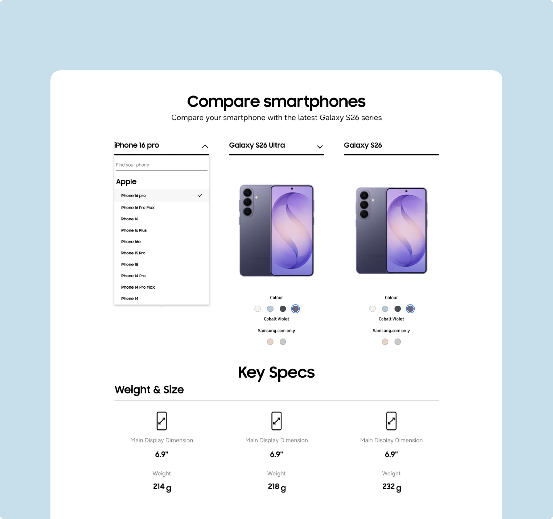
User picks their existing device (make and model) for comparison.
- 03
Trade-In CTA above the model specifications opens a pre-populated form.
- 04
Storage and device condition options are selected so a Trade-In price can be returned.
- 05
User can close the window; the device selection and inputs are retained.
- 06
Trade-In CTA inside the configurator at the top of the page opens the same pre-populated form — single source of truth.
Trade-In-initiated comparison: the user starts in the Trade-In flow inside the configurator, and their known device auto-populates the comparison table further down the page.
- 01
User interacts with the Trade-In option inside the configurator.
- 02
User selects make, model and storage.
- 03
Even if the user abandons the Trade-In flow, the known device is captured.
- 04
Known device populates in the comparison table when scrolled to, or jumped to via anchor link from the top nav.
- 05
If the user re-enters the configurator, the pre-loaded Trade-In window opens with their device already known.
Section 10
Design Challenges & Key Developments
Four problem/solution pairs that shaped the system end-to-end.
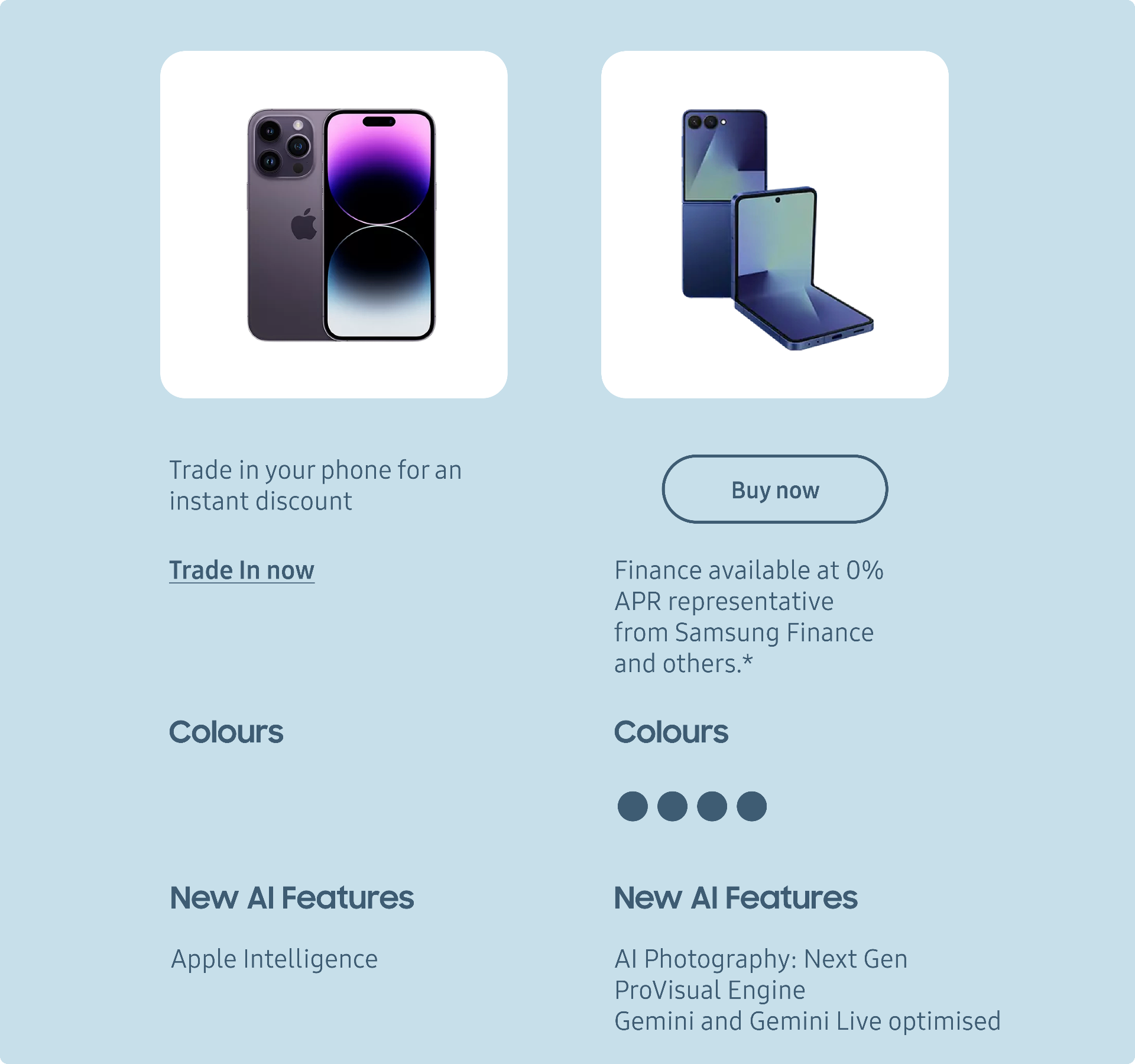 01
01Comparing Against the User's Own Phone
Problem
The live comparison table only knows about new Galaxy models. Customers carrying a 2-year-old Galaxy — or an iPhone — see no information that helps them decide whether the upgrade is worth it, and have to leave the page to find out.
Solution
Extended the comparison component to accept the user's current device as a third column, populated either by explicit selection ("Compare with your phone") or by signals from the Trade-In flow. The table now answers the real question — what do you actually gain by upgrading from this specific device?
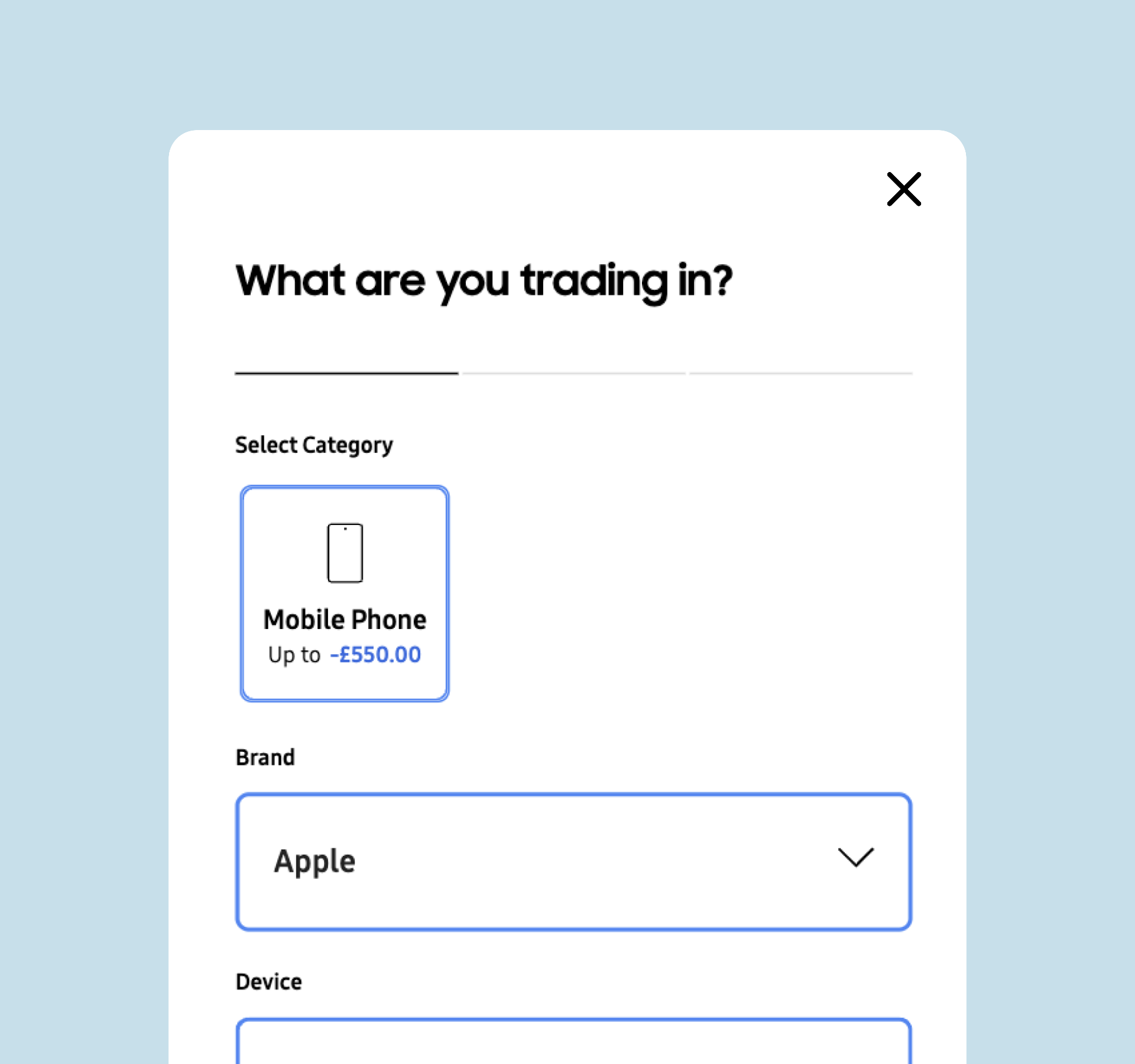 02
02Trade-In as Part of the Comparison, Not a Separate Step
Problem
Trade-In and comparison lived in different places on the page. Customers had to choose between understanding the upgrade and pricing the upgrade — and most never did both.
Solution
Tied Trade-In into the comparison directly: selecting your device for comparison pre-populates the Trade-In form, and entering Trade-In auto-populates the comparison table. The two surfaces share state, so the upgrade decision and the actual cost-after-trade-in are visible in the same flow.
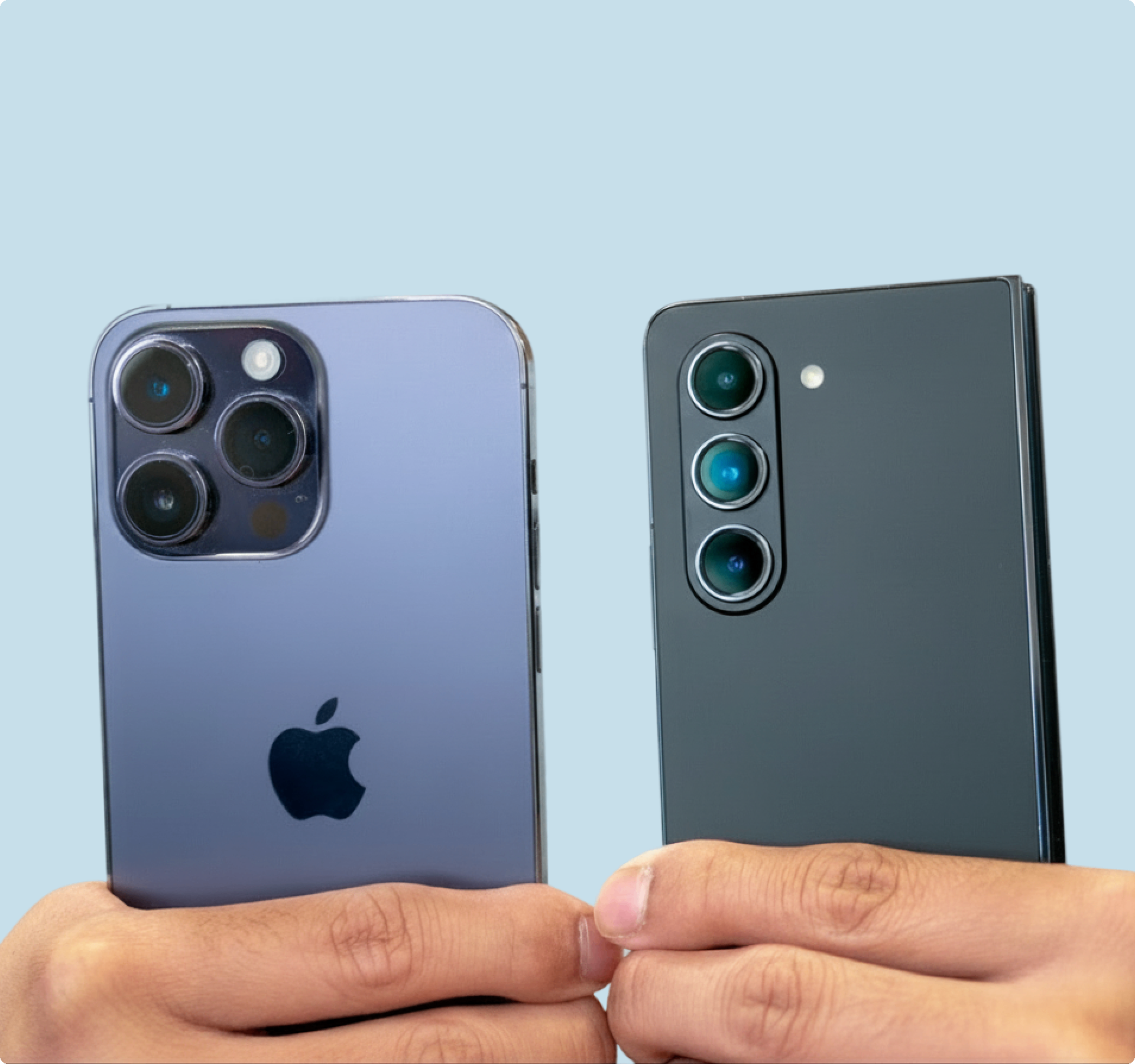 03
03Switching iPhone Users
Problem
iPhone owners are a meaningful share of premium foldable intenders, but the existing page treats them as if they don't exist. There is no equivalent comparison, no familiar reference points and no explicit answer to "why switch?"
Solution
Added iPhone models as first-class options in the device picker, with the comparison structured around the features iPhone switchers care about — camera, AI, ecosystem and form factor. Switching messaging is content-led inside the comparison, not bolted on as a separate page.
 04
04Reducing Cognitive Load on the Buy Page
Problem
Without a customised comparison, customers have to research differences elsewhere — competitor sites, reviews, forums — and often drop out of the buying journey to do it. The page is making customers leave to make their decision.
Solution
Pulled the comparison they would have done off-page into the buy page itself, structured around their actual device. The table is scoped tightly (handful of high-impact specs) and reuses the same component on mobile and desktop, so the decision can be made in one place.
Next case study