Customer Onboarding Page
Design and build of 8 customer support environments for new Samsung product owners. Organising product help content for an improved onboarding experience.
Client
Samsung Electronics
Role
Product Designer
Duration
120+ pages · Wireframes · User testing · Prototyping
Platform
Desktop · Mobile
Success metrics — measured over 1 year
Generic UP usage grew from the low thousands into the high single-digit thousands, driving customers into logged-in states, generating positive customer feedback and a rise in registered devices.
Generic UP usage
users into logged-in states
Up from ~1,200 at launch — measured over 12 months
Customer feedback
positive responses logged
Post-onboarding sentiment captured over 1 year
Device registration
newly registered devices
Trusted-device setups completed in the same period
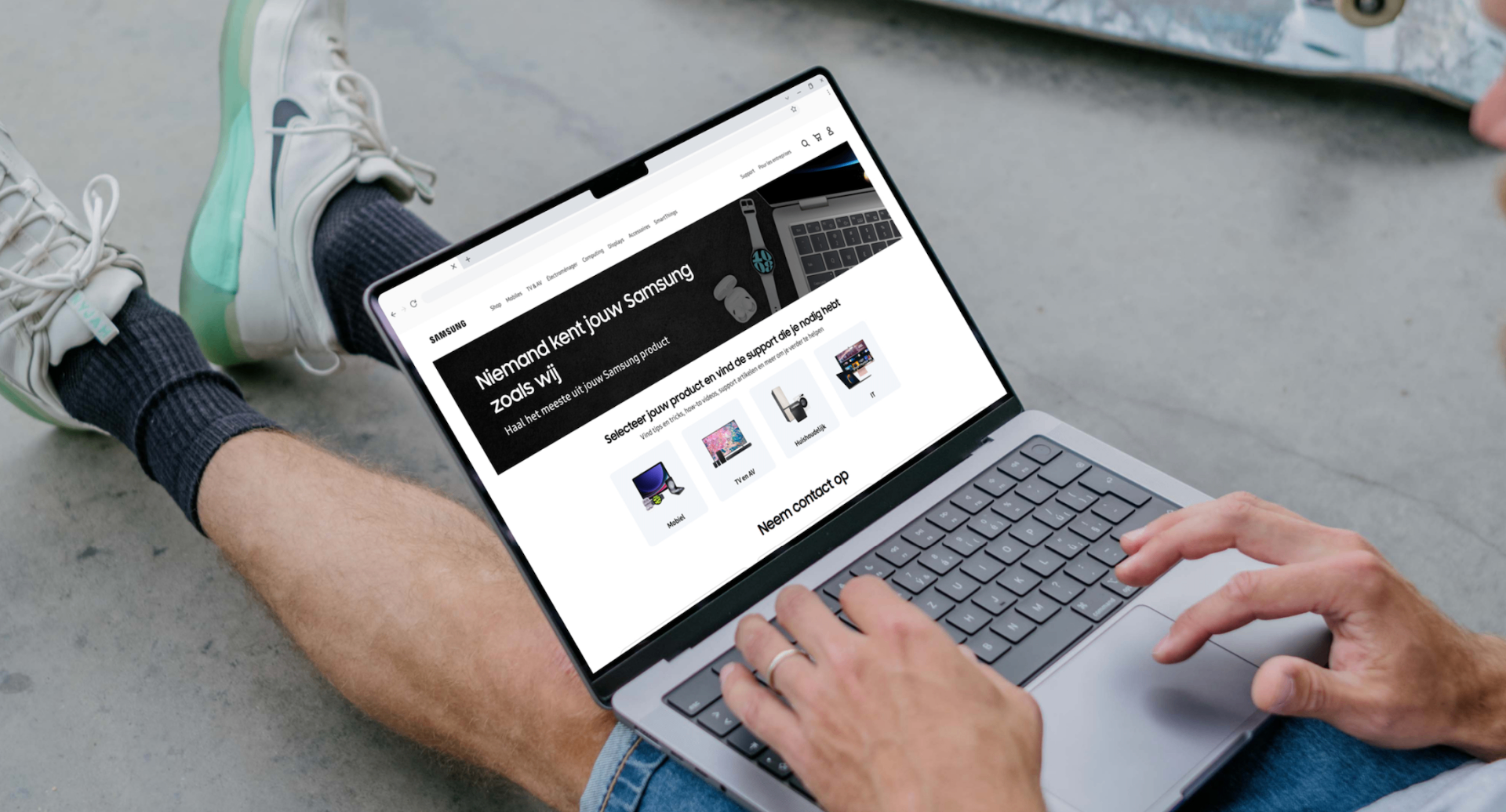
Customers with new products had no direct, consistent path to help with their device. The existing customer registration page led up to 90+ available offline Samsung support areas, with written device tier prevention separated across silos — increasing support call volume and raising the cost to onboard a new owner.
Qualitative interviews, contextual observation and quantitative analysis were used to assess the underlying needs and behaviours of the audience.
- 01
Ran a 4-week discovery sprint working closely with the consulting team, meeting with stakeholders to determine the experience and brand.
- 02
Benchmarked elements of the prior site and audited 120+ pages across the existing Durban user studies.
- 03
Planned a phased rollout of refreshed designs aligned to the corporate Samsung Galaxy direction, sequencing editorial work so each surface could ship independently.
- 04
Designed and prototyped 8 customer support environments — covering hub, card, tabbing, and carousel patterns — and validated them through user testing.
Iterative prototyping moved the concept from low-fidelity sketches to a tested interactive build, refined through usability sessions and stakeholder review.
Section 05
Design Challenges & Key Developments
Four problem/solution pairs that shaped the system end-to-end.
 01
01Design and Rule System
Problem
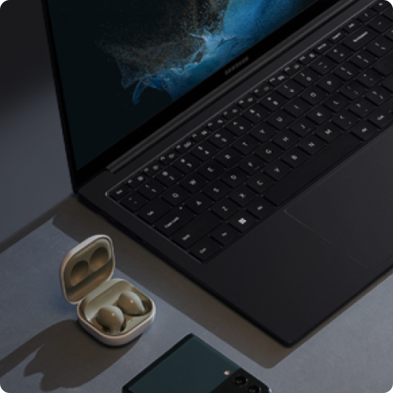
Customers landing on the support pages were routed across siloed templates that made it difficult to find the right page for their product. There was no consistent hub pattern across the site.
Solution
Built a hub layout that orients the customer first — surfacing product, model and topic, then guiding them down to the relevant 8+ support environments with a clear typographic system tuned for high-density content and readability.
 02
02Card and Tile Design
Problem
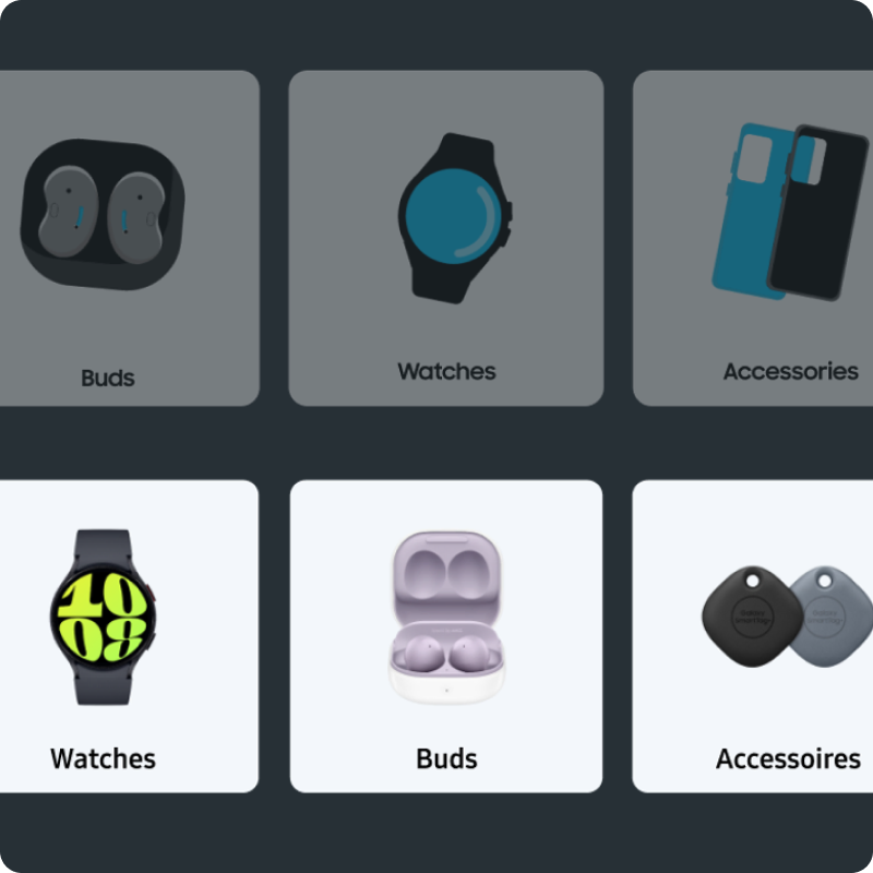
The existing card components were dense, inconsistent in proportion and unfriendly to scan. There was no shared card or tile language across the Samsung catalogue — every team rolled their own, which broke trust between the product and support areas of the site.
Solution
A flexible card and tile component, with sizing, spacing, type and imagery rules that could stretch from a small support row to a merchandised product grid. A documented set of variants gave teams in the wider organisation a re-usable system that scaled across the entire support surface.
 03
03Tabbing and Logic
Problem
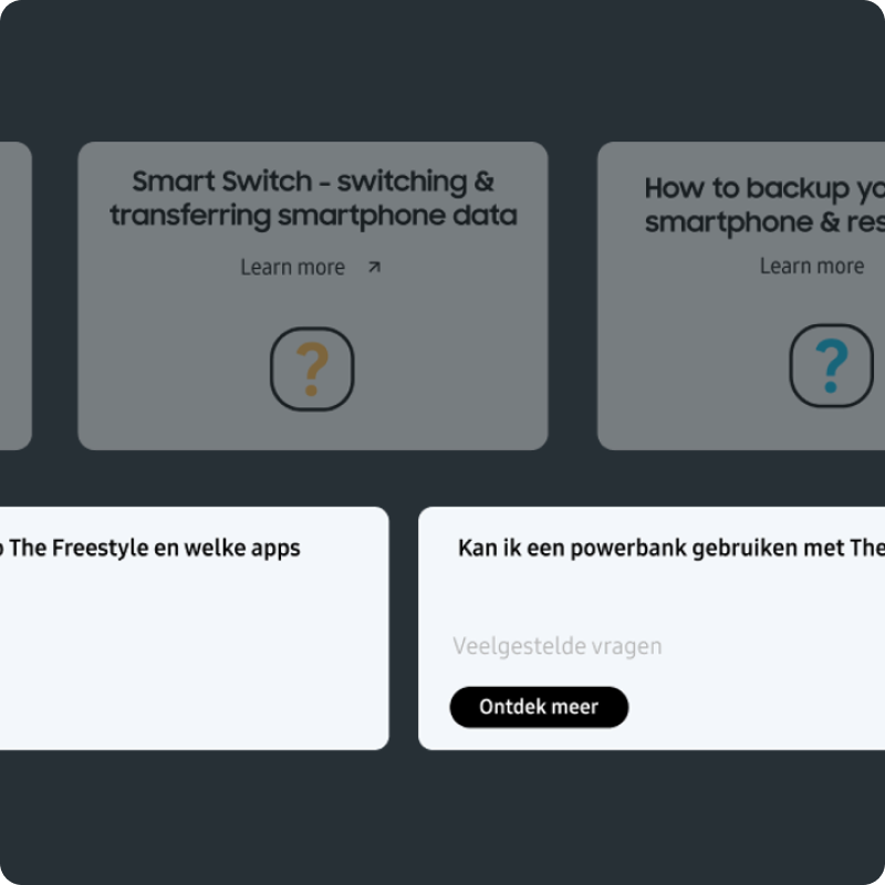
Support pages relied on long scrolls or PDF-style attachments to expose information. There was no clear tabbing rule, so editors couldn't compose pages without help and customers couldn't predict where information lived.
Solution
A simple, predictable tab pattern with editorial rules — paired with a logic model for when to use tabs, accordions or full-page splits. Content authors got a kit they could compose without needing engineering or design every time.
 04
04Carousel Design
Problem
The carousel on the existing site was treated as a dumping ground for any page-level content. The hit area was small, the indicators were unclear, and on mobile the interaction quietly failed for the majority of taps. Critical onboarding content was lost inside it.
Solution
A redesigned carousel with a clearer hit area, accessible controls and a stronger editorial structure. Once placement rules were defined and the interaction was rebuilt for touch, the carousel could be trusted as the primary surface for editorial onboarding content again.
Designing 120+ support pages taught me that consistency at scale is really a documentation problem, not a visual one. Hub, card, tab and carousel patterns only held up because the rules behind them — when to use what, and why — were written down for editors and engineers who would never speak to the design team. The lesson I took away: a component is only as useful as the rules that travel with it, and onboarding clarity for the customer starts with onboarding clarity for the people composing the pages.
Next case study