Contact Us Page — EU New Standard Template
Review and re-design of the customer contact platform. The second most visited page across all Samsung domains. Defining a new user flow through an intent based journey. Saving £5 million per year as a cost to company brought through customer support interactions.
Client
Samsung Electronics
Role
Product Designer
Duration
6 months · Wireframes · User testing · Prototyping
Platform
Desktop · Mobile
Success metrics — measured impact
Projected savings of £5M over a 1-year course, modelled across the 14 countries the flow was designed for.
Projected savings
over a 1-year forecast
Modelled from the live run
Run period
projection window
Baseline → iterated flow
Markets designed for
countries rolled out
Localised across EU & global regions
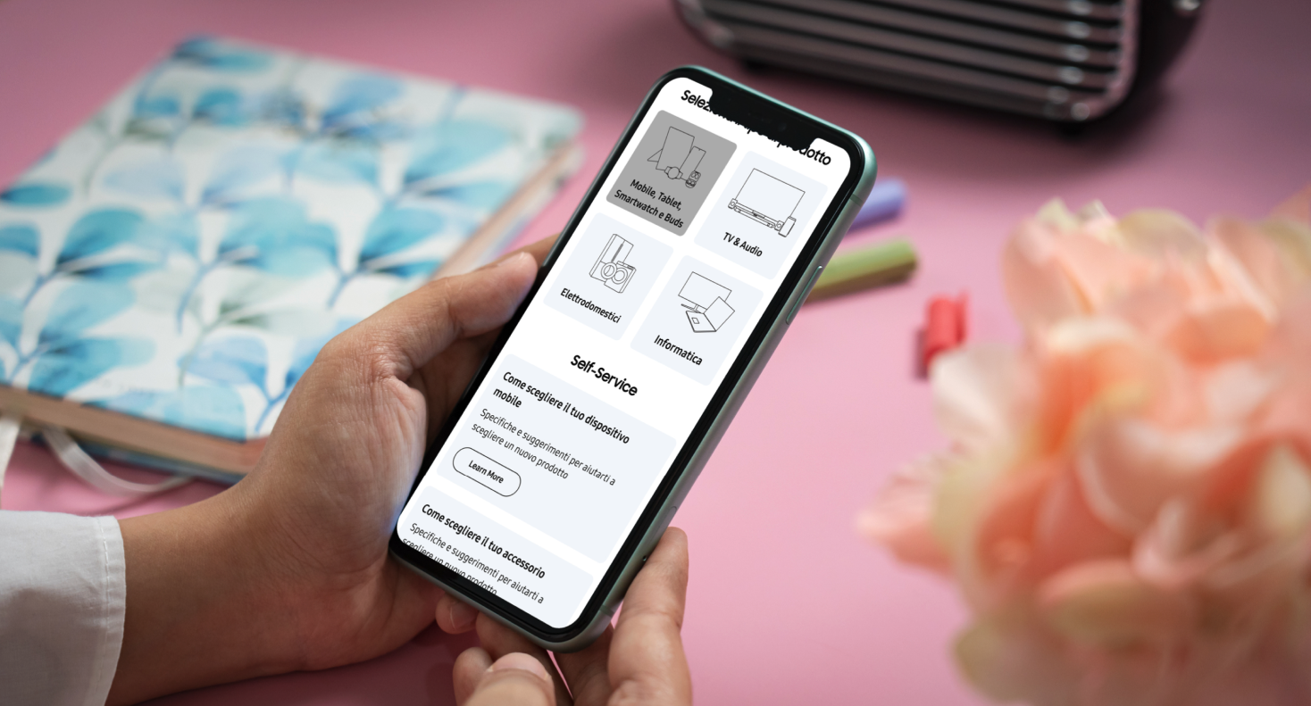
The existing Contact Us page was a long, undifferentiated catch-all that routed every customer through the same list of channels regardless of intent. It was the second most visited page across all Samsung EU domains and the highest source of avoidable support contacts — driving a multi-million pound annual cost to serve and a poor experience for owners trying to self-solve.
Qualitative interviews, contextual observation and quantitative analysis were used to assess the underlying needs and behaviours of the audience.
- 01
Audited the current Contact Us experience across 14 EU markets and benchmarked equivalent journeys across consumer electronics peers.
- 02
Ran intent-mapping workshops with the contact centre and support ops teams to model the real reasons customers reach out.
- 03
Built a new intent-led IA that routes customers to the lightest channel that can resolve their query before exposing live agents.
- 04
Prototyped, tested and shipped a single EU template that scales from mobile through to tablet and desktop breakpoints.
Iterative prototyping moved the concept from low-fidelity sketches to a tested interactive build, refined through usability sessions and stakeholder review.
Section 05
Design Challenges & Key Developments
Four problem/solution pairs that shaped the system end-to-end.
 01
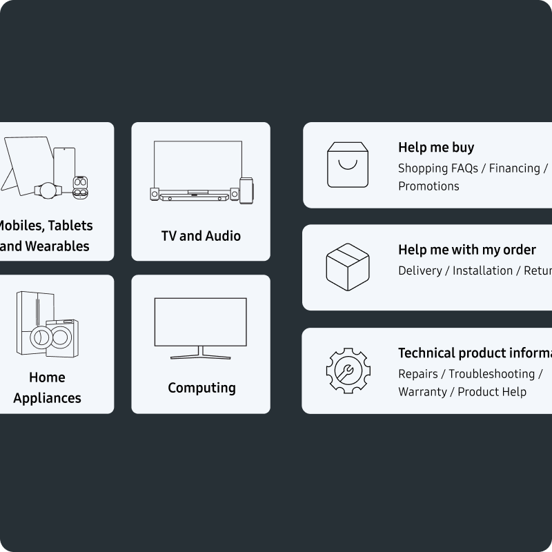
01Mobile First Design
Problem
The legacy template was a desktop layout squeezed onto mobile. Touch targets were small, the content order didn't reflect what mobile owners actually needed, and the page was the highest-bounce surface in the support funnel on small screens.
Solution
Rebuilt the page mobile-first around a clear visual hierarchy and a tuned type system. Primary intents lead, channels follow, and every interactive element is sized for thumb reach — making the page usable as a first port of call rather than a fallback.
 02
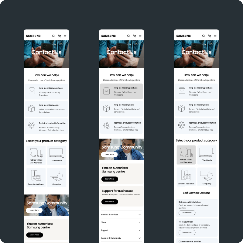
02Intent Based Query Resolution
Problem
Customers were forced to pick a channel before describing what they needed. Phone and chat were used for problems an article or a guided flow could resolve instantly, and customers with urgent issues were buried in the same list as everyone else.
Solution
Introduced an intent-first step that captures what the customer is trying to do, then matches it against the lightest channel that can resolve it. Self-serve answers, guided flows and human channels are surfaced in the right order for the query.
 03
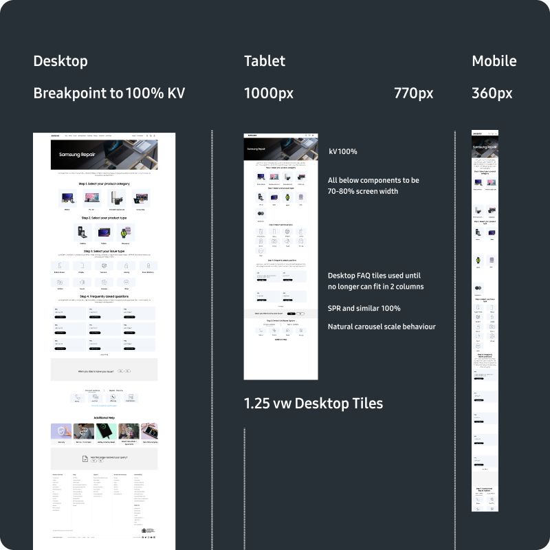
03Tablet Viewport and Breakpoint Definition
Problem
The existing template only defined mobile and desktop breakpoints. Tablet traffic — a meaningful share across EU markets — fell into an awkward in-between state where components stretched, wrapped or collapsed in ways that broke the layout.
Solution
Defined a dedicated tablet breakpoint with its own grid, type scale and component rules. Cards, intents and channel modules reflow predictably between mobile, tablet and desktop, so the template holds up across every device the analytics surfaced.
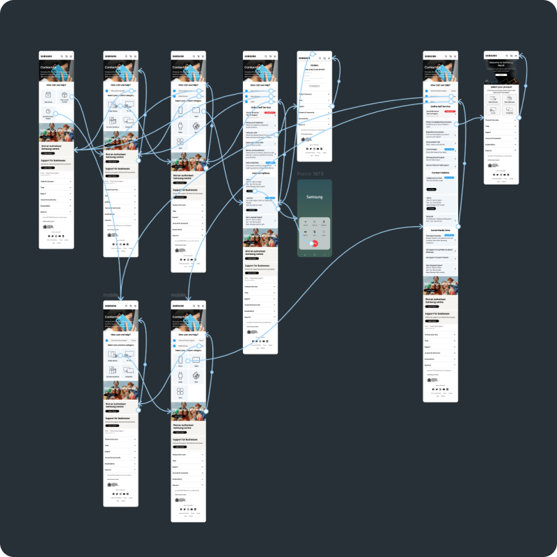 04
04Moderated Flow Testing (anchor vs breadcrumbs)
Problem
Early prototypes used anchor links to jump customers between sections of the page. In moderated testing, participants lost their place, didn't realise they were still on the same page, and couldn't reliably get back to where they started.
Solution
Replaced anchored navigation with a breadcrumb-led pattern that makes the customer's position in the flow explicit. Moderated sessions confirmed customers could move forward, back out, and re-enter the journey without losing context.
Redesigning Contact Us across 14 markets reframed support for me as an intent problem, not a channel problem. The page only got lighter once we stopped asking customers to pick how they wanted help and started asking what they were trying to do. The breadcrumbs-over-anchors finding from moderated testing was the other big lesson: navigation cues that feel redundant to a designer often turn out to be the thing keeping the customer oriented. I now treat intent capture and explicit position-in-flow as defaults for any high-traffic service page.
Next case study