Repair Service Options / Troubleshooting
Improving an existing service on the Samsung support site, using new testing methods to build user trust in the live resource. Improving the quality of feedback metrics through iteration of page steps and interactions.
Client
Samsung Electronics
Role
Product Designer
Duration
4 months · User testing · Prototyping · Iteration
Platform
Desktop · Mobile
Success metrics — measured impact
Projected savings of £8M over a 3-year course, modelled from a 6-month live run period across the 14 countries the flow was designed for.
Projected savings
over a 3-year forecast
Modelled from the 6-month live run
Run period
live measurement window
Baseline → iterated flow
Markets designed for
countries rolled out
Localised across EU & global regions

Although we built a system that customers could turn to for repair issues, we were finding that a key step had been overlooked — drawing in the same customers we wanted to drive interaction. We were losing customers at key entry points and were not exposing the live, through-site service properly. Users couldn't get to the depth of help in the resource. We needed to take a wider, more wholistic look in order to make sure new users could pass for the first time — those who came to the resource page once.
Qualitative interviews, contextual observation and quantitative analysis were used to assess the underlying needs and behaviours of the audience.
- 01
Audited the current Repair / Troubleshooting page across desktop and mobile, mapping every entry point, decision and drop-off.
- 02
Re-tested the existing flow with a new pool of users to capture qualitative friction the analytics couldn't surface.
- 03
Iterated the live page in short cycles — adjusting interactions, hierarchy and copy, then re-testing before each release.
- 04
Re-baselined the feedback metrics so we could measure trust and task completion against a known starting point.
Iterative prototyping moved the concept from low-fidelity sketches to a tested interactive build, refined through usability sessions and stakeholder review.
Section 05
Design Challenges & Key Developments
Four problem/solution pairs that shaped the system end-to-end.
 01
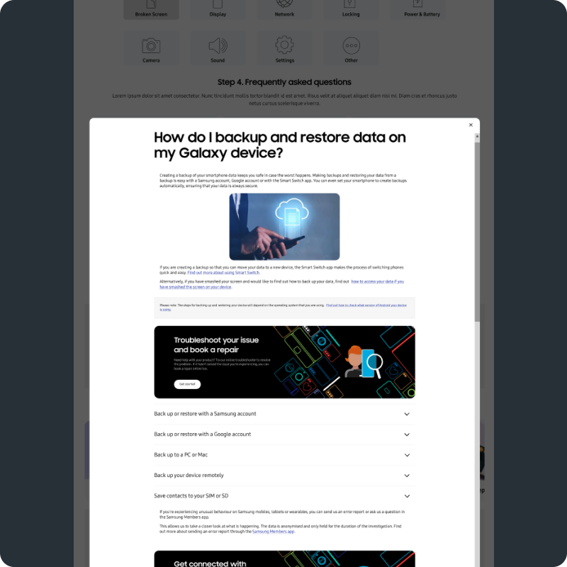
01Interaction revisions
Problem
The existing interactions on the troubleshooting page were inconsistent across steps. Users couldn't predict what each control would do, so they hesitated, mis-clicked, or abandoned the flow before reaching a resolution.
Solution
A simpler, more legible interaction model across the full troubleshooting page. We aligned every step to the same input pattern, tightened the feedback on each tap, and re-tested with users to confirm the new interactions held up across both desktop and mobile journeys without slowing repeat users.
 02
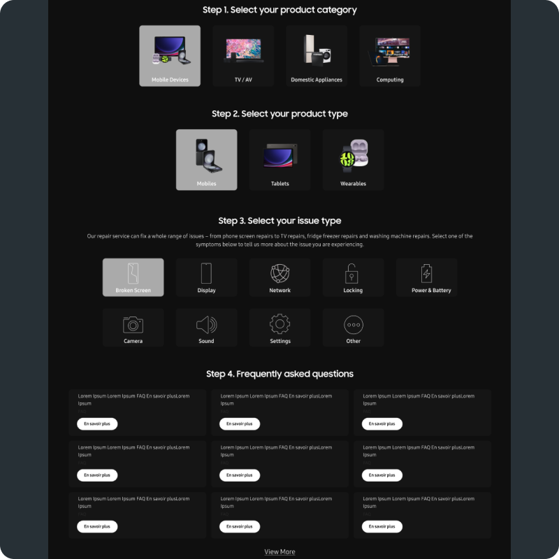
02Dark mode & Accessibility
Problem
The troubleshooting screens carried over the legacy light palette and weren't tuned for accessibility. Contrast, focus order and tap targets all broke down in dark mode and on smaller devices — the surface was unusable for a meaningful share of customers.
Solution
Re-built the screens against an accessible dark and light token set with clear focus states, larger tap targets and a consistent contrast ratio across components. Customers who arrive in dark mode now get a first-class experience instead of a fall-back.
 03
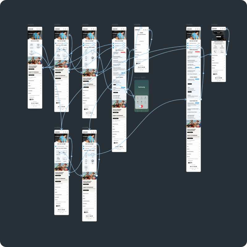
03Step 4 Testing
Problem
When testing the original flow, Step 4 was where most participants quietly dropped off. The screen tried to confirm a diagnosis and book a repair in the same view, and users couldn't tell whether they had finished the task or were being asked to commit to a service.
Solution
We split Step 4 into two clearer moments — a confirmation of the diagnosis, then a separate decision about what to do next (self-serve, contact, or book repair). Re-running moderated testing on the split flow showed customers could move through Step 4 confidently and over 90% of testers reached a resolved outcome.
 04
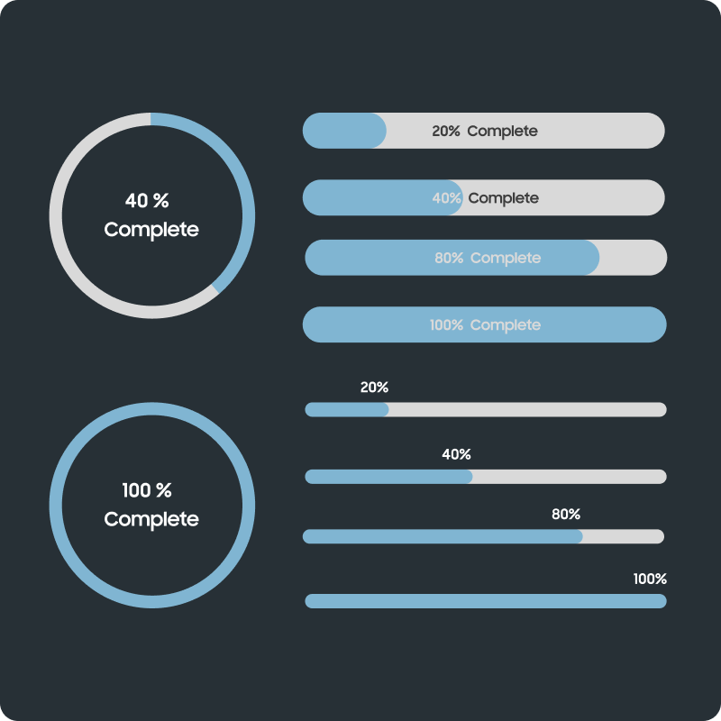
04Progress indication
Problem
Customers couldn't see where they were in the troubleshooting journey. The page had no clear sense of how many steps remained, so even users who could resolve their issue gave up because the flow felt open-ended.
Solution
Introduced a calm, persistent progress indicator at the top of every step. It shows the current step, the total number of steps, and an honest indication of how close the user is to a resolution. Re-tested flows showed users were more likely to push through to the end of the journey once they could see how short it actually was.
Iterating on a live troubleshooting flow taught me that trust in a self-serve resource is built one micro-interaction at a time. Splitting Step 4 and adding a calm progress indicator each looked like small UI tweaks, but they materially changed whether customers believed the page could actually resolve their issue. The wider lesson: when analytics show drop-off, the fix is almost always to make the customer's position and the remaining effort more honest, not to add more content.
Next case study