TV Buy Page Optimisation
TV optimisation strategy for the Samsung eStore — redesigning the premium TV buy page (with a focus on the 2025 Neo QLED range) into a seamless, mobile-first, conversion-led journey.
Client
Samsung Electronics · Cheil
Role
Lead UX/UI Designer
Duration
Jan 2026 · Heuristics · Metrics · CMI Research · Prototyping
Platform
Desktop · Mobile
Outcomes — A/B tested in production
Note: the full PDP redesign was not shipped end-to-end. Components were validated as isolated A/B tests on the live Samsung site.
TV size upsell
+4,200 units / test window
55" shoppers moving to 65"+
Finance uptake — Neo QLED
+1,900 finance plans
during A/B exposure on range
User sign-in (free delivery)
+38,500 account sign-ins
incentivised at checkout
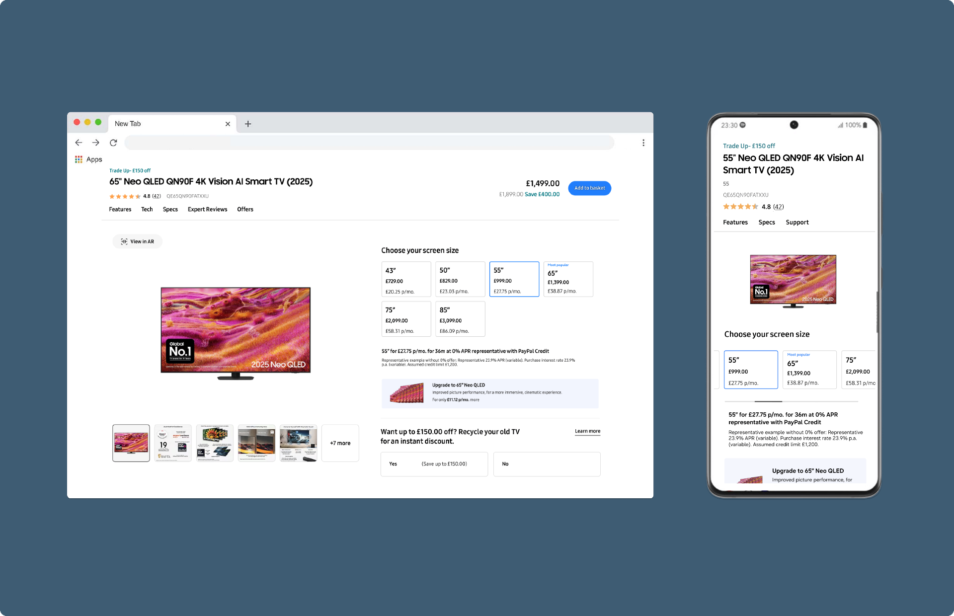
Current performance of Samsung premium TV sales is below the business target. As direct selling via the Samsung eStore is one of the most critical channels for SEUK, it's essential to continually improve the customer experience and encourage more customers to purchase the latest Samsung premium TVs directly from the eStore. The goal is to optimise the buying experience — ensuring a seamless, mobile-first and customer-centric journey that increases engagement and sales, with a particular focus on the premium 2025 Neo QLED range.
Behavioural data confirmed and quantified the heuristic findings — most of the page is invisible to most customers.
Scroll-depth funnel
Attention on top-of-page features vs bottom
OLED buyers also buy a soundbar (vs 11% QLED)
Cross-size journey before checkout — price comparison
Click heatmap — share of clicks
Section 13
Design Challenges & Key Developments
Four problem/solution pairs that shaped the system end-to-end.
 01
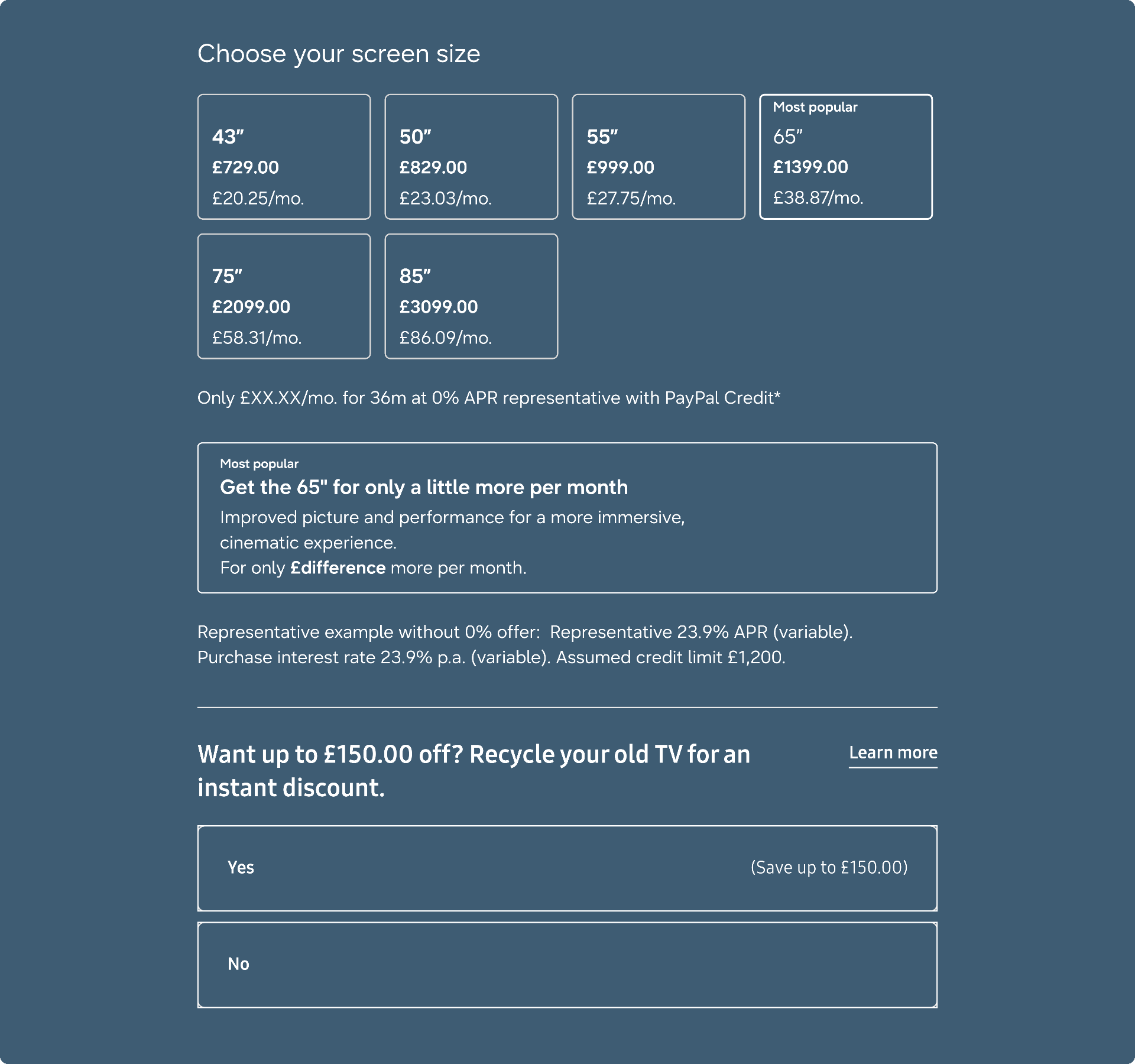
01Right-Hand Column Hierarchy
Problem
On the live page the right-hand column mixes payments, finance, customisation and RTBs without a clear priority. Finance options — a known conversion lever — are buried, and customers can't see the full cost picture above the fold.
Solution
Re-ordered the right-hand column around the buying decision: price and finance first, then customisation (size, colour, model), then add-ons and reasons-to-buy. Finance terms are exposed as a primary message, not a secondary link, on both mobile and desktop.
 02
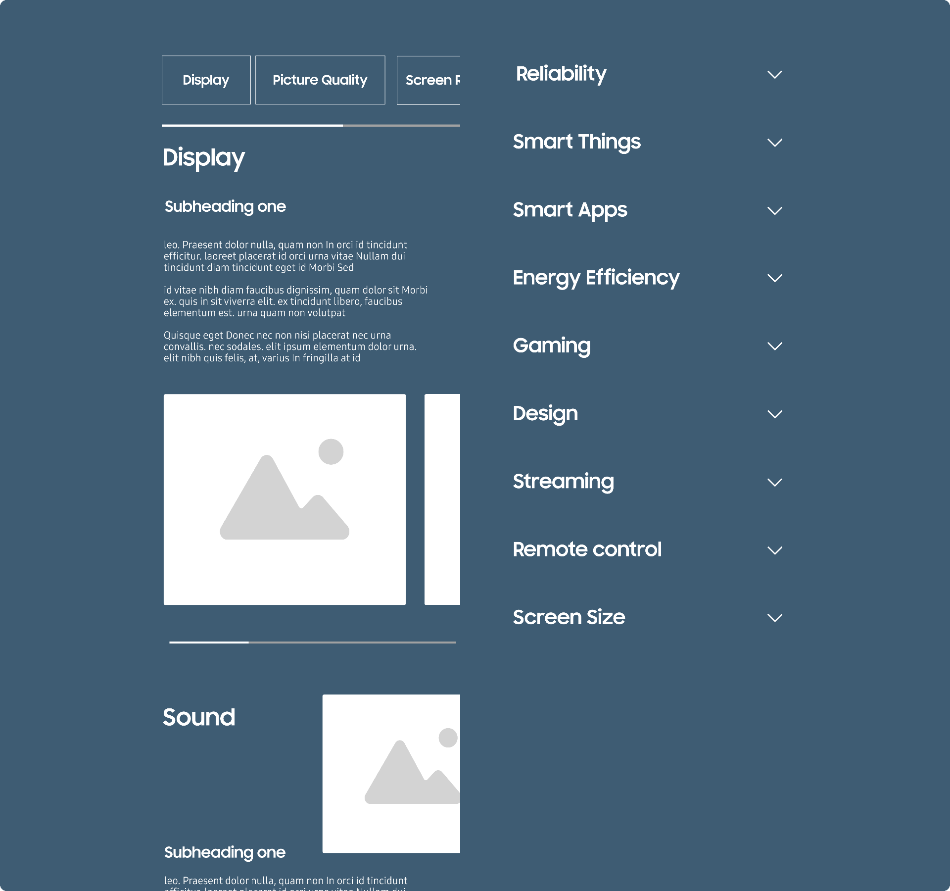
02Mobile-First Feature Scannability
Problem
Feature content is dense and reads like a spec sheet. With only 28% of visitors reaching the middle of the page and 9% reaching the bottom, most customers never see the differentiators that justify the premium price.
Solution
Condensed feature blocks into scannable cards, led by the top-ranked CMI priorities (display, picture, sound, smart). The most differentiating Neo QLED features are pulled above the fold; deeper specs are progressively disclosed for users who want them.
 03
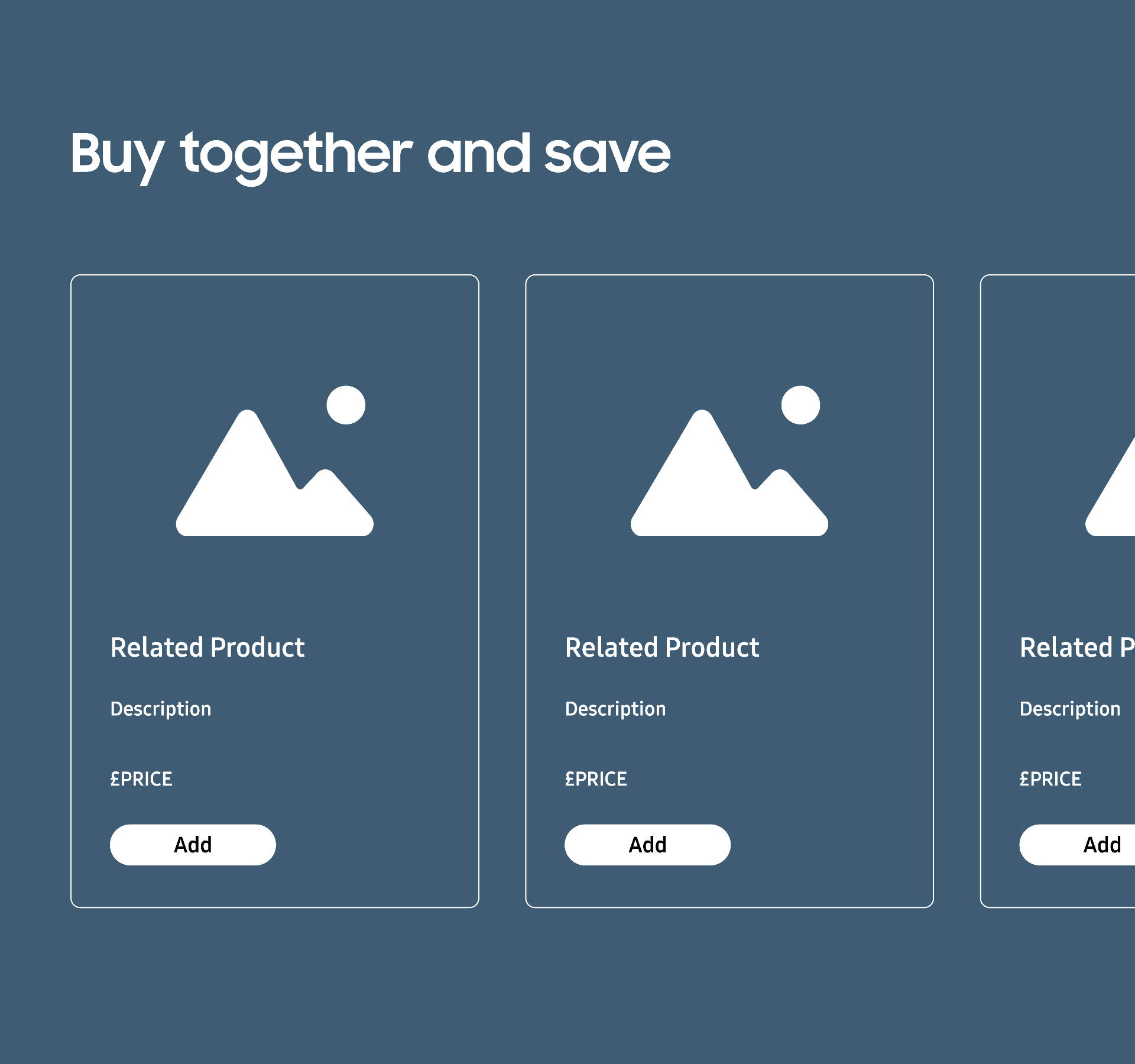
03Add-Ons in the Right Moment
Problem
Add-ons (soundbars, wall mounts, care plans) sit in a position on the page where they don't get seen and don't get clicked — despite clear research evidence (16% of OLED buyers also buy a soundbar) that the attach opportunity is real.
Solution
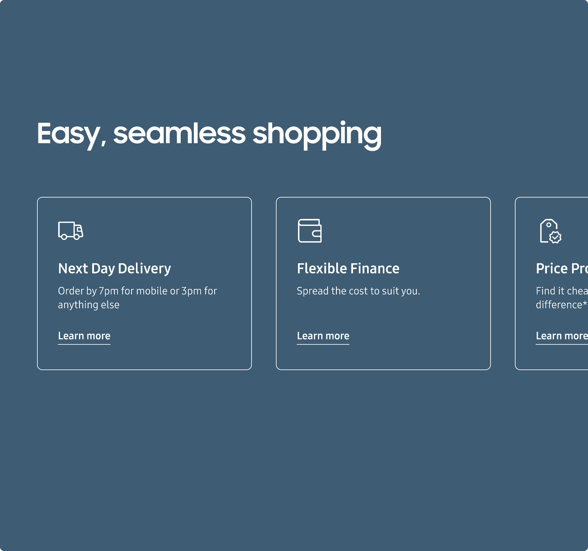
Three patterns prototyped: inline soft bundles directly under the CTA, a grouped 'easy shopping' module, and an add-ons interstitial between PDP and basket. Each pattern is tested against attach rate so add-ons are surfaced where customers are already deciding.
 04
04Behaviour-Led Personalisation
Problem
Every customer — first-time visitor, repeat visitor, loyalty member, basket abandoner — sees the same page. The page can't react to what the customer already knows or what they've already done.
Solution
A modular personalisation layer with rules for when and how to swap content blocks. Loyalty members see point-earning prompts, repeat visitors see re-prioritised features, and price-sensitive flows (cross-size traffic) surface the Price Promise earlier. The template stays the same — the priority shifts.
Next case study