Tablet Finance Optimisation
Creating a simplified, transparent and engaging finance experience on the Samsung tablet buy page — improving customer understanding of monthly and total cost, and ultimately driving higher finance adoption.
Choose reading length
Client
Samsung Electronics · Cheil
Role
Lead UX Designer
Duration
3 months
Platform
Desktop · Mobile
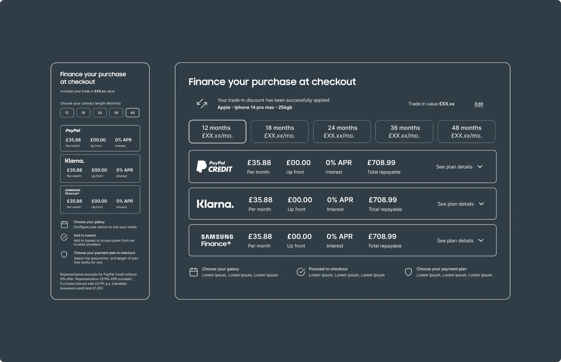
Users on the Samsung tablet buy page can see an attractive monthly price but might struggle to judge which plan fits them best and wonder how finance works and when. Finance is a strong reason to buy direct from Samsung, but the current proposition is buried within offers and relies on a dense pop-up.
Qualitative interviews, contextual observation and quantitative analysis were used to assess the underlying needs and behaviours of the audience.
- 01
Increase finance engagement and grow finance adoption, measured by completed finance uptake at checkout.
- 02
Help customers find finance more easily and understand both monthly and total cost.
- 03
Let customers compare options without overload and feel confident about affordability.
- 04
Surface finance more clearly without adding noise to the buy page — starting with tablets.
Iterative prototyping moved the concept from low-fidelity sketches to a tested interactive build, refined through usability sessions and stakeholder review.
Primary success measurement is completed finance uptake at checkout. Engagement and checkout progression explain whether the proposition is being seen and helping customers convert.
- 01
Engagement — % of buy-page users interacting with finance.
- 02
Progression to basket — % of finance-engaged users reaching checkout.
- 03
Conversion — % of completed purchases using finance.
Finance isn't something participants arrive at with a fixed position — they actively weigh it in the moment, often triggered by how and where it's surfaced on the product page.
- 01
Active comparison: participants compare outright and monthly paths side by side before committing.
- 02
Placement and hierarchy matter — finance visibility directly affects whether it is considered at all.
- 03
The 0% APR message is load-bearing: it unlocks consideration from outright-buyer segments.
- 04
Transparency over optimism — honest, base-level pricing builds more trust than maximum-scenario savings.
Zoning data across Galaxy Tab S10 and S11 showed similar visibility of the finance offer, but very different behaviour after it.
- 01
Finance offer seen on buy page: 13.0% (S10) vs 11.2% (S11).
- 02
Finance offer tapped: only 0.36% (S10) and 0.12% (S11) — a visible link alone does little to explain monthly affordability.
- 03
Finance seen in the cart segment: 48.1% for S11 vs 4.12% for S10 — S11 may need finance later in the decision.
- 04
Payment messages compete: on S11, PayPal Pay Later receives more buy-page taps than the 0% finance link (0.23% vs 0.12%).
Where they overlap: customers need a clear monthly price where they judge affordability, and Samsung needs finance to be understood before the purchase decision.
- 01
The monthly cost is not clear while comparing tablets, and understanding the plans takes another step.
- 02
Monthly affordability has limited visibility near the price.
- 03
Other payment messages may divide attention.
Benchmarked Google, Apple, Sony, AO, Currys and John Lewis. Competitors generally show finance close to the product price or buying controls — Samsung already does this, so the useful comparison is how clearly each explains the options after showing a monthly price.
The opportunity is to help customers understand their choices: compare terms, see the full cost, understand how savings affect payments, and know what happens when they select finance.
- 01
“Is 36 months my only option?” — a clear payment-plan comparison near the summary.
- 02
“Is there a deposit, what is the total repayable, and who provides the credit?” — a clearer expandable cost breakdown.
- 03
“Which savings actually reduce my monthly payment?” — a clearer link between trade-in, promotions and the finance price.
- 04
“What happens when I select pay monthly?” — a more explicit next step from price to applying for finance.
Purchase sessions progress significantly deeper into the page, while bounce sessions drop away rapidly. Research showed finance is not always an existing consideration — the page has to surface it, and when 0% APR is visible it can shift customers from an upfront-payment mindset towards finance.
- 01
Poor discoverability and competing trade-in/promotional messaging create confusion, limiting finance's impact.
- 02
Key opportunity: make finance visible and understandable at the point of price consideration, alongside trade-in and offers.
Two personas shaped how finance should appear across the journey.
- 01
Finance-first buyer — finance is a purchase requirement: monthly affordability must be visible immediately, stay accurate as storage, trade-in and offers change, and be transparent before commitment.
- 02
Outright buyer — enters thinking in full price but may consider finance when it sits beside price; outright and finance should be comparable without leaving the task, with either route equally easy to complete.
Section 13
Design Challenges & Key Developments
Finance on the tablet buy page had the same root problem showing up in four places: the offer was present, but it wasn’t useful.
- 01
Where finance sat
It lived inside the Gifts and Savings module alongside PayPal Pay Later, competing for the same attention as every other offer. Few customers ever opened the detail.
- 02
What the market showed
Benchmarking Google, Apple, Sony, AO, Currys and John Lewis showed this wasn’t a Samsung-only gap. Every retailer surfaces a monthly price early, but explaining the plan options afterwards is the weakest step across the market — which reframed the work as an explanation problem rather than a visibility one.
- 03
Giving finance its own place
Finance moved out of the offers module into a section of its own, immediately after trade-in: monthly price, 0% APR and provider names together. A “compare finance options” breakdown opens only when a customer wants it, so the page stays easy to scan while the terms stay reachable.
- 04
Making trade-in show up in the price
The chosen device feeds a lower monthly price, shown in blue to confirm it already includes trade-in value, with an edit route back to the device. Affordability stops being a guess.
The consistent principle across all four moves: state the real cost plainly beside the price, and let customers compare without leaving the page.
Exposure alone doesn't explain behaviour — finance needed judging on whether customers open the detail, understand a plan and continue to purchase. Framing the work around customers' real questions, rather than the offer itself, kept the solution focused on transparency and comparison instead of louder messaging.
Next case study